
Welcome to the world of color! Whether you’re an artist, designer, or someone who loves color, understanding color theory can change how you see the world and use colors in your creations. Color theory is all about how colors work together and how they affect our emotions, moods, and designs. In this guide, I’ll walk you through everything you need to know about color theory, explained in simple terms perfect for beginners.
What is Color Theory?
Color theory is a set of rules and guidelines that explain how colors mix, work in harmony, and affect the way we feel. Colors are powerful—they can make us feel happy, calm, excited, or even angry. By understanding color theory, you can learn how to choose the right colors to send the message you want.
For example, have you ever noticed how certain rooms or websites make you feel relaxed while others make you feel energized? That’s color theory at work! Artists, designers, and marketers all use color theory to make you feel a certain way or draw attention to something important.
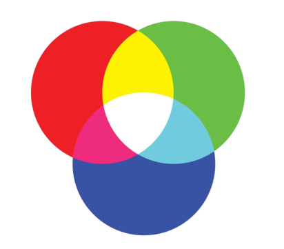
RGB of Color Theory
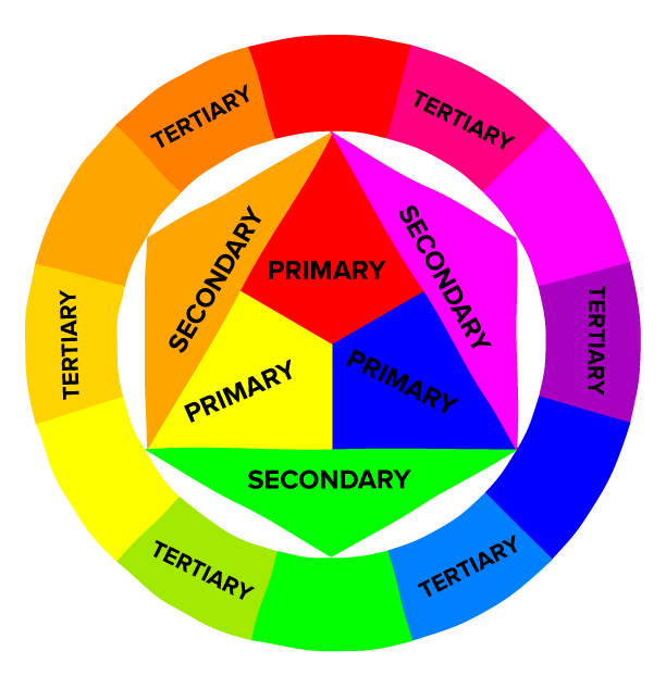
The Color Wheel
The color wheel is one of the most important tools in color theory. It helps you see how different colors relate to each other. Think of the color wheel as a rainbow bent into a circle. The color wheel shows three main groups of colors: primary, secondary, and tertiary.
Primary Colors
The three primary colors are:
- Red
- Blue
- Yellow
These are the building blocks of all other colors. You can’t mix any colors to make primary colors—they stand on their own.
Secondary Colors
When you mix two primary colors, you get a secondary color:
- Red + Blue = Purple
- Blue + Yellow = Green
- Red + Yellow = Orange
These are the colors that sit between the primary colors on the color wheel.
Tertiary Colors
Tertiary colors are made by mixing a primary color with a secondary color next to it on the color wheel. For example:
- Red + Orange = Red-Orange
- Blue + Green = Blue-Green
These colors add more depth and variety to your color choices.
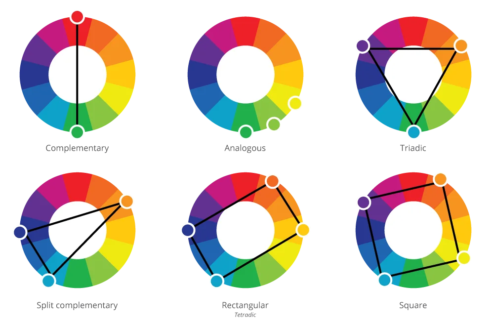
Color Harmony
Color harmony is all about finding colors that look good together. Some color combinations are very bold and stand out, while others are softer and more peaceful. Let’s explore three ways to create color harmony.
Complementary Colors
Complementary colors are colors that sit directly across from each other on the color wheel, like red and green or blue and orange. When you put these colors together, they create a high-contrast look. Think of the bright red and green you see during Christmas. Complementary colors create a lot of excitement and energy. But be careful—too much contrast can be overwhelming. If you’re using complementary colors, it’s a good idea to let one color be the star and the other color play a smaller role.
Analogous Colors
Analogous colors are colors that sit next to each other on the color wheel, like blue, blue-green, and green. These colors create a smooth, calming effect because they naturally blend into each other. You often see analogous colors in nature, like the different shades of blue and green in the ocean or the sky. Analogous color schemes are great for creating a peaceful, harmonious feeling in your art or design. Since the colors are similar, they’re easy on the eyes and can help create a sense of balance.
Triadic Colors
Triadic colors are three colors that are evenly spaced around the color wheel, like red, yellow, and blue. Triadic color schemes are bold and vibrant. Because the colors are balanced, they create a lively, energetic look without being too overwhelming. Artists often use triadic color schemes in cartoons, logos, and children’s books because they are bright and attention-grabbing.
Warm vs. Cool Colors
Another important part of color theory is understanding the difference between warm colors and cool colors. These groups of colors create very different moods and feelings.
Warm Colors
Warm colors include reds, oranges, and yellows. These colors remind us of warm things, like the sun or fire. Warm colors make us feel happy, excited, or even a little angry. They bring energy and passion to a design. Think of how a bright red or orange flower stands out in a garden.
Cool Colors
Cool colors include blues, greens, and purples. These colors remind us of cool things, like the ocean or a calm forest. Cool colors make us feel calm, peaceful, or sad. They bring a sense of relaxation and balance to a design. Think of how a soft blue sky or a deep green forest makes you feel relaxed.
Knowing when to use warm colors and when to use cool colors can help you create the right mood in your art or designs.
Color Value
Color value is about how light or dark a color is. Every color can have different values. For example, you can have a light blue or a dark blue. Light colors are called tints because they are mixed with white, and dark colors are called shades because they are mixed with black.
Why is Color Value Important?
Color value helps create contrast in your art. Contrast means the difference between light and dark. If you want something to stand out, you can use light colors against dark colors or vice versa. For example, a white object on a black background stands out because the contrast is strong.
Artists also use color value to show light and shadow, which adds depth to a painting or design. Adding shadows with darker colors can make your art look more realistic.
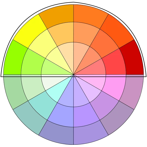
Color Saturation
Color saturation refers to how bright or dull a color is. Highly saturated colors are pure and vivid, while low-saturation colors are muted and less intense.
High Saturation vs. Low Saturation
- High saturation colors are bright and bold. Think of neon signs or a clear blue sky. These colors grab attention and create excitement.
- Low saturation colors are softer and more subdued. Think of pastels or faded, vintage colors. These colors feel more relaxed and calmer.
When you want something to stand out, you use highly saturated colors. When you want a softer, more subtle look, you lower the saturation.
The Psychology of Color
Colors don’t just make things look good—they also make people feel certain emotions. This is called color psychology, and it’s why we often associate certain colors with specific moods or meanings.
Common Color Meanings:
- Red: Passion, energy, danger, love
- Blue: Calm, trust, sadness, stability
- Yellow: Happiness, optimism, caution
- Green: Nature, growth, harmony, health
- Purple: Luxury, creativity, mystery
- Black: Power, elegance, mourning
- White: Purity, simplicity, peace
By using the right colors, you can influence how people feel about your work. For example, using blue in a website design might make people feel calm and secure, while using red might create a sense of urgency or excitement.
How Artists and Designers Use Color Theory
Now that you know the basics of color theory, let’s talk about how artists and designers use these tools to create stunning work.
Creating Mood and Atmosphere
Artists use color to set the mood in their work. If an artist wants to create a peaceful, calm scene, they might use cool colors like blues and greens. If they want to create energy and excitement, they might use warm colors like reds and oranges.
Designers also use color to guide people’s emotions. For example, websites that want to seem trustworthy often use blue because it’s associated with calmness and reliability.
Drawing Attention
Designers use color contrast to draw attention to specific parts of a design. For example, a bright red button on a white background will stand out and grab attention, which is why it’s often used in ads or websites to make people click.
Artists also use contrast in their work to highlight important areas or to create a focal point where they want the viewer’s eyes to go.
Creating Balance
Color harmony helps artists and designers create balance in their work. Too much contrast can be jarring, while too little can be boring. By using colors that work well together, artists create a sense of unity in their work.
Visuals by Toshia D.
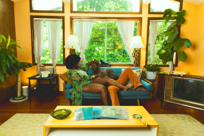
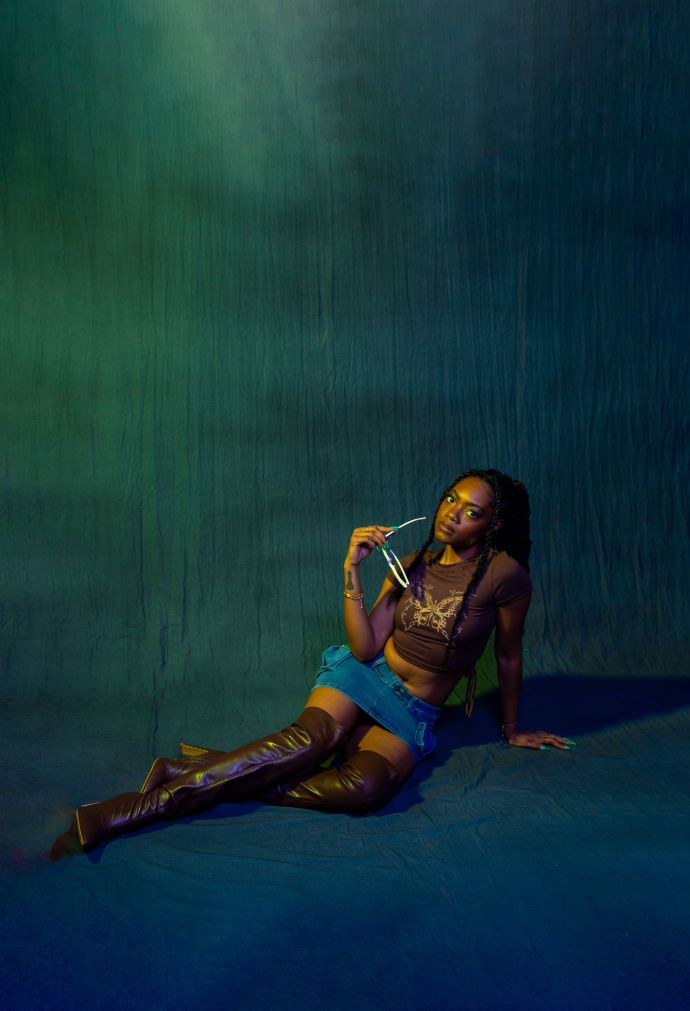
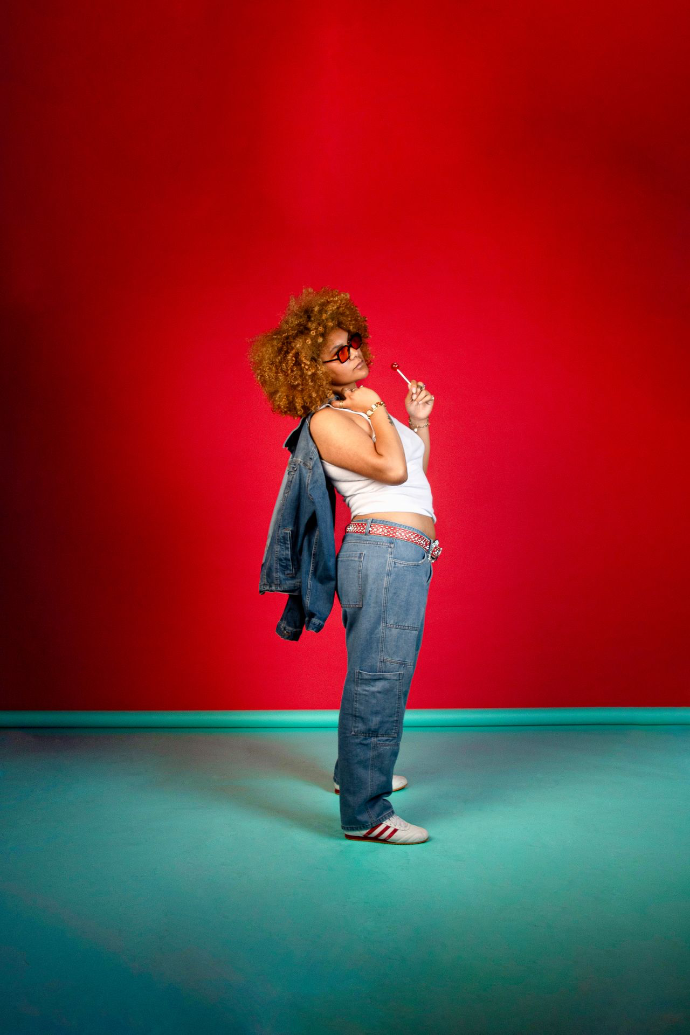
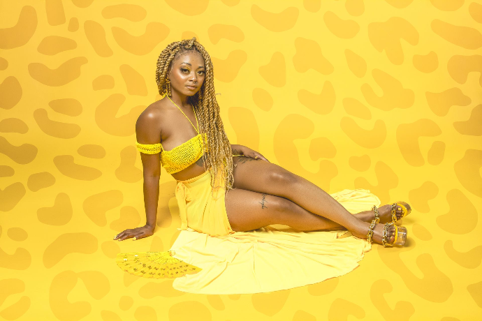
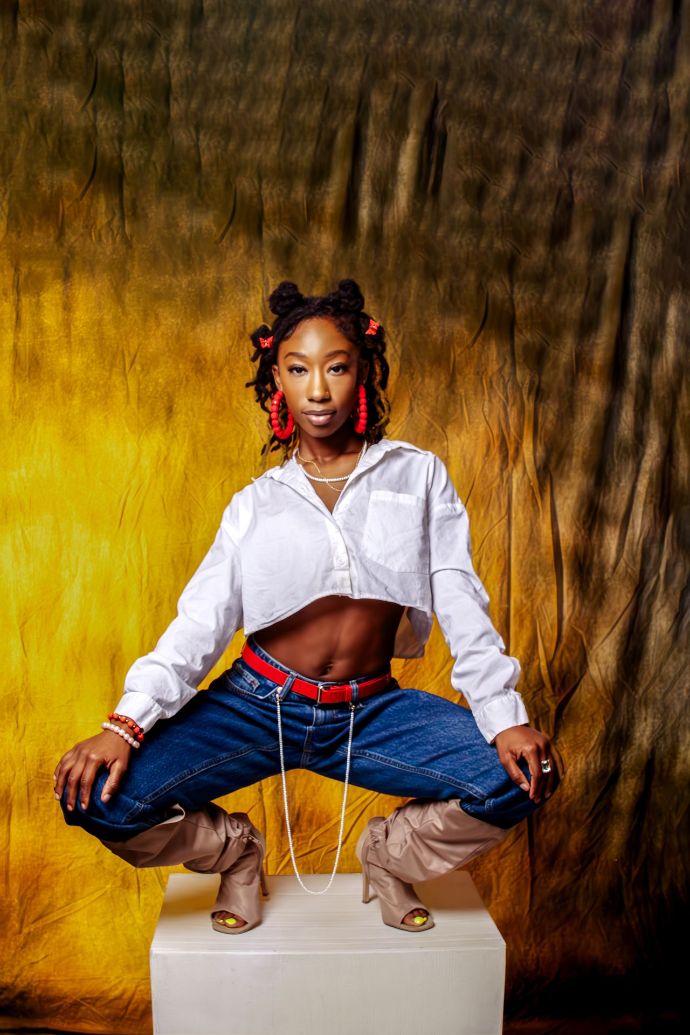
See Toshia's Instagram for more
Practical Tips for Using Color in Your Work
Here are some tips to help you use color theory effectively in your art or designs:
- Start with a color wheel: When planning your colors, use a color wheel to find harmonious color schemes that will look good together.
- Limit your color palette: Don’t use too many colors in one piece of art. Stick to a few key colors to keep your design clean and focused.
- Use contrast to highlight important details: Use high-contrast colors to draw attention to specific areas of your work. For example, use dark colors against light colors to create focus.
- Experiment with tints and shades: Play with lighter and darker versions of your colors to create depth and variety.
- Pay attention to color psychology: Choose colors based on the emotions you want to create. For example, if you want to create a calming mood, use cool colors like blue and green.
Mastering Color Theory
Mastering color theory can take your art and design to the next level. By understanding how colors work together and how they affect our emotions, you can create more powerful, effective designs that resonate with your audience. Remember, color theory is not just about making things look pretty—it’s about creating meaning, mood, and connection. So, experiment with the colors you use, and watch how they transform your work! Whether you’re a beginner or a seasoned artist, understanding color theory is key to mastering your craft. Keep practicing, and soon you’ll see how powerful colors can be in shaping your art!